The "emotional" painting
What this painting is. . . well, it's a painting using tempera paint. It's a paint that dries very quickly and it has a chalky texture to it. We were given the assignment of making a painting that represented an emotion that anyone can feel. We were only allowed to use only one color for this, and I chose the mood of confusion and used the color blue. I thought that the color blue would represent confusion better than the other colors available.
Overall
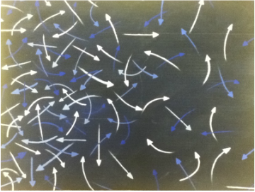
First of all, sorry because the picture turned out a bit 'faded out' I don't have a decent camera in the house. I decided to do many arrows pointing in various directions to show all of the decisions in life, and how confusing it may be. Sometimes it may become so crowded and hectic, but there are times where you only have to make a few easy choices.
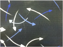
#1 Hectic Side
This is a small portion of the hectic side of the painting. Where many confusing decisions are made, and so much is going on. I made sure to mix many lights and darks on this side to make things look even more confusing. I had to overlap many of the arrows so it didn't look as empty when I was done painting it.
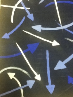
#2 Empty
The empty side is where easy decisions are made, and there isn't much going on. Very few arrows are overlapping and nothing is too confusing. This would be me durring the summer days, or on days off. There is nothing going on and nothing is too confusing to solve. There is plenty of time and space to do whatever you want to do.
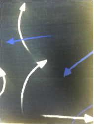
#3 In Between
This is were the two sides fade into each other. On one side its very empty, while on the other you have a confusing mix of arrows that are all different colors. I had to slowly fade it so there wasn't an abrupt change of arrows and people wouldn't become so confused.
